Game Voucher E-Commerce
Wallet Codes Mobile App
October, 2020 - March, 2021
Role: Product Designer | Duration: 5 Weeks | Team: Forest Interactive
About the Product
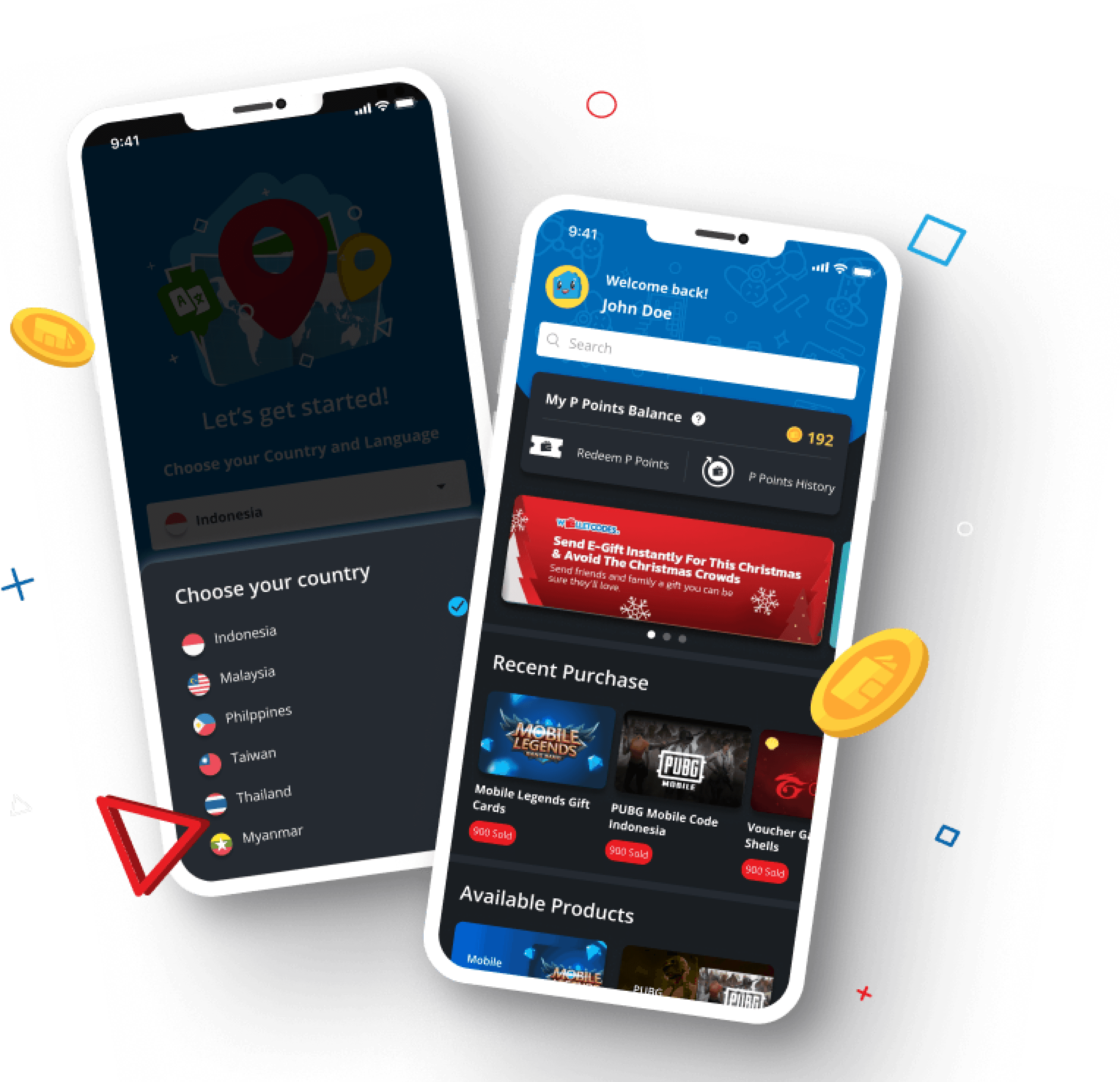
Wallet Codes Mobile Apps


Purchase In-game currencies
(98% from total products)
Entertainment Subscription
(2% from total products)
Available in 7 Countries

Background
When I started joining the company, they already have the website version and the Business Team gave these insights:
📈👥
High Visitor During COVID-19
During COVID-19, website visitors increased by 35.8% from Q1 to Q2 of 2020. The number was even higher in Q3, with a 72.8% increase.
📉🛒
High Visitor, Drop Checkout Page
Only 3.85% complete checkout, and 2.78% complete payment
📱
Previous Survey: 64% Regular Customer expect to have a mobile app
Faster and more secure payment (usually need to open mobile app to confirm payment). Also faster future purchase
UXR METHOD #1:
User Interviews
5 users who are most frequent buyers during the last 3 months.
This session aim to gain more perspective about user's reasoning and motivation
Key Insights :
Motivation why user purchase denominations:
Category 1: "Skin Collector"

Category 2: "Combat"
Fast Purchase, user want to go back playing the game immediately.

Time to dig deeper
What methods of UX research I will use to help drive clarity and focus to my solution, and why?
UXR METHOD #2:
Moderated Usability Testing
Current website in mobile view and direct competitor's product.
The goal of this session not only to assess how the current market, but also to understand how participant interact and perceive competitor's product. Here are the result from the testing session:
SUMMARIZE
Research Takeaways
#1.
Difficulty and Slow Process in Finding Products
User already know what to buy
Both access search bar and top selling
Additional: Good to have to encourage user to explore other voucher products, not just game vouchers, could be beneficial for broader engagement and sales within the app.
#2.
Inability to View Overall Information During Checkout, Leading to Excessive Scrolling
User often scroll up and down to make sure the denomination and payment selection
Guest user can purchase
Fast purchase ➡️ back playing game

Problem Statement
How I might improve purchase experience to increase completion checkout in the mobile app version?
Brainstorming & Prioritization
Stakeholder Discussion

Collaborate with Stakeholders (Country Manager, Business Team, Devs, Designers, PM, QA) to find possible solution.
Additionally, we discussed each country's objectives and priorities. The goal of this session was to explore various solutions and ensure alignment on goals before moving to the design phase.


Option A: Common Flow
Reduce scroll by separating Select Variation and Select Payment Page
Common behavior from existing e-commerce, user don't have to learn
Testing Result: Good, no complaint
Design Exploration
Concept Testing - A/B Testing
Option B: Timeline View
Combine Select Variation and Select Payment in one page
User can see summary and payment changes in one page
Uncommon behavior for e-commerce
Testing Result: Preferred
Design Exploration
Concept Testing - A/B Testing
Proposed Design Solution
Research Takeaways and Design Improvement
Problem Space #1: Difficulty and Slow Process in Finding Products
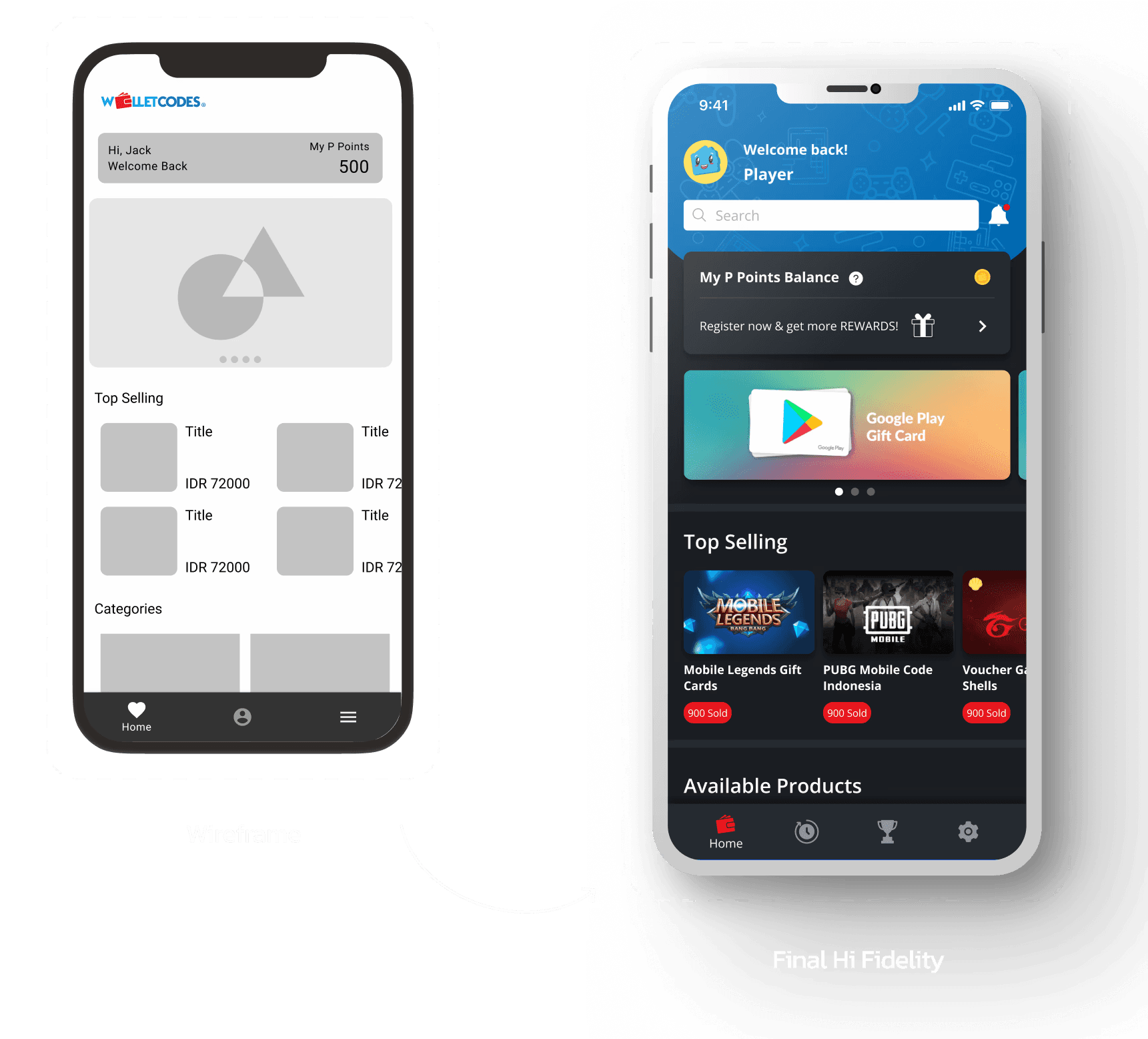
Introduce sections for Top Selling (for Guest Users) and Recent Purchases (for Logged-In Users) on the Homepage to expedite product selection.
Create a wider search bar for a larger tap area. Place it at the top of the screen, but not too close to the upper edge, for easier accessibility
Proposed Design Solution
Research Takeaways and Design Improvement
Problem Space #2: Inability to View Overall Information During Checkout, Leading to Excessive Scrolling
Implement timeline view that updates with each switch can ensure users are aware of these changes.
Total Payment component info stick to the bottom, it's near to the thumb tap area when user decide to pay
Constraint: Currently only Improving updates on the checkout page, as the payment page redirects to a third-party site.

Design Validation
Unmoderated Usability Testing

Test Insight
Overall, the feedback from testers was very positive.
Acceptable Task Completion Rate (75%)
Drop off reported because some of participant's device aren't compatible to download the prototype file
Impact
#1. User spent more time in the homepage exploring products
30.83%
User Engagement Increased
26s
Avg. Time Duration also increased for 11.6%
#2. More user who complete the checkout process in Checkout Page
25.2%
Increased Conversion Rate
Comparing the first month after launch to the third month.
Metrics insights were gathered using analytical tools and from Business Team
Impact
#3. Additional Impact
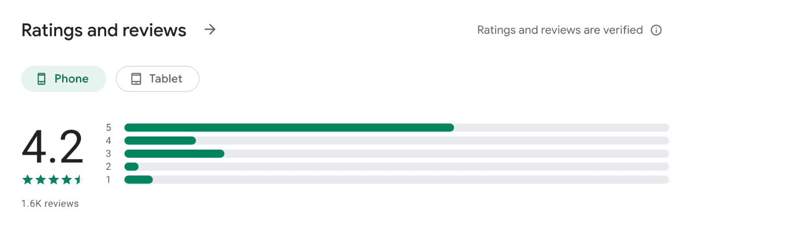
Successfully gained 100k+ downloads of the apps in Google Playstore
Achieved Rating 4.1 out of 5 based on user feedback in Google Playstore

Comparing the first month after launch to the third month.
Metrics insights were gathered using analytical tools and from Business Team
If I had more time…
Improve the product to increase number of sign up users
Explore on game rank/ratings update, such as "Top Server Leader Board" for each season
Explore more on rewards mecahnism
My biggest challenges was..
I'm unfamiliar with game industries. Also, addressing numerous issues and expectation from various countries and only deliver a solution on a single platform.
My biggest takeaways was..
Early usability testing on both the current website and competitors' sites was crucial for identifying flaws and discovering areas for improvement.
Reflection
Thank You!
Nuwiya Amal
Game Voucher E-Commerce
Wallet Codes Mobile App
October, 2020 - March, 2021
Role: Product Designer | Duration: 5 Weeks | Team: Forest Interactive
About the Product
Wallet Codes Mobile Apps
Purchase In-game currencies
(98% from total products)
Entertainment Subscription
(2% from total products)
Available in 7 Countries
Background
When I started joining the company, they already have the website version and the Business Team gave these insights:
📈👥
High Visitor During COVID-19
During COVID-19, website visitors increased by 35.8% from Q1 to Q2 of 2020. The number was even higher in Q3, with a 72.8% increase.
📉🛒
High Visitor, Drop Checkout Page
Only 3.85% complete checkout, and 2.78% complete payment
📱
Previous Survey: 64% Regular Customer expect to have a mobile app
Faster and more secure payment (usually need to open mobile app to confirm payment). Also faster future purchase
UXR METHOD #1:
User Interviews
5 users who are most frequent buyers during the last 3 months.
This session aim to gain more perspective about user's reasoning and motivation
Key Insights :
Motivation why user purchase denominations:
Category 1: "Skin Collector"
Category 2: "Combat"
Fast Purchase, user want to go back playing the game immediately.
Time to dig deeper
What methods of UX research I will use to help drive clarity and focus to my solution, and why?
UXR METHOD #2:
Moderated Usability Testing
Current website in mobile view and direct competitor's product.
The goal of this session not only to assess how the current market, but also to understand how participant interact and perceive competitor's product. Here are the result from the testing session:
UXR METHOD #2:
Moderated Usability Testing
Current website in mobile view and direct competitor's product.
The goal of this session not only to assess how the current market, but also to understand how participant interact and perceive competitor's product. Here are the result from the testing session:
SUMMARIZE
Research Takeaways
#1.
Difficulty and Slow Process in Finding Products
User already know what to buy
Both access search bar and top selling
Additional: Good to have to encourage user to explore other voucher products, not just game vouchers, could be beneficial for broader engagement and sales within the app.
#2.
Inability to View Overall Information During Checkout, Leading to Excessive Scrolling
User often scroll up and down to make sure the denomination and payment selection
Guest user can purchase
Fast purchase ➡️ back playing game
Problem Statement
How I might improve purchase experience to increase completion checkout in the mobile app version?
Brainstorming & Prioritization
Stakeholder Discussion
Collaborate with Stakeholders (Country Manager, Business Team, Devs, Designers, PM, QA) to find possible solution.
Additionally, we discussed each country's objectives and priorities. The goal of this session was to explore various solutions and ensure alignment on goals before moving to the design phase.
Option A: Common Flow
Reduce scroll by separating Select Variation and Select Payment Page
Common behavior from existing e-commerce, user don't have to learn
Testing Result: Good, no complaint
Design Exploration
Concept Testing - A/B Testing
Option B: Timeline View
Combine Select Variation and Select Payment in one page
User can see summary and payment changes in one page
Uncommon behavior for e-commerce
Testing Result: Preferred
Design Exploration
Concept Testing - A/B Testing
Proposed Design Solution
Research Takeaways and Design Improvement
Problem Space #1: Difficulty and Slow Process in Finding Products
Introduce sections for Top Selling (for Guest Users) and Recent Purchases (for Logged-In Users) on the Homepage to expedite product selection.
Create a wider search bar for a larger tap area. Place it at the top of the screen, but not too close to the upper edge, for easier accessibility
Proposed Design Solution
Research Takeaways and Design Improvement
Problem Space #2: Inability to View Overall Information During Checkout, Leading to Excessive Scrolling
Implement timeline view that updates with each switch can ensure users are aware of these changes.
Total Payment component info stick to the bottom, it's near to the thumb tap area when user decide to pay
Constraint: Currently only Improving updates on the checkout page, as the payment page redirects to a third-party site.
Design Validation
Unmoderated Usability Testing
Test Insight
Overall, the feedback from testers was very positive.
Acceptable Task Completion Rate (75%)
Drop off reported because some of participant's device aren't compatible to download the prototype file
Impact
#1. User spent more time in the homepage exploring products
30.83%
User Engagement Increased
26s
Avg. Time Duration also increased for 11.6%
#2. More user who complete the checkout process in Checkout Page
25.2%
Increased Conversion Rate
Comparing the first month after launch to the third month.
Metrics insights were gathered using analytical tools and from Business Team
Impact
#3. Additional Impact
Successfully gained 100k+ downloads of the apps in Google Playstore
Achieved Rating 4.1 out of 5 based on user feedback in Google Playstore
Comparing the first month after launch to the third month.
Metrics insights were gathered using analytical tools and from Business Team
If I had more time…
Improve the product to increase number of sign up users
Explore on game rank/ratings update, such as "Top Server Leader Board" for each season
Explore more on rewards mecahnism
My biggest challenges was..
I'm unfamiliar with game industries. Also, addressing numerous issues and expectation from various countries and only deliver a solution on a single platform.
My biggest takeaways was..
Early usability testing on both the current website and competitors' sites was crucial for identifying flaws and discovering areas for improvement.
Reflection
Thank You!
Nuwiya Amal